01 · Foundation
Built on shadcn/ui.
LaserOwl does not have a component library of its own. It is shadcn/ui: components copied into the repository, so we own them and can read every line, on Radix primitives and Tailwind. Our work is a theme, a few tokens and some compositions on top.
- Components
- shadcn/ui, copied into components/ui
- Style
- radix-vega
- Base colour
- Neutral, with a warm turn
- Primitives
- Radix UI
- Styling
- Tailwind CSS 4, CSS variables
- Icons
- Lucide
The layers
Each layer only uses the one beneath it. A screen never reaches past the kit to a raw element.
- ScreensHome, a place, a record, a shared pageCompose custom components and the kit
- Custom componentsComposer, tiles, message blocks, owl empty statesBuilt only from kit parts, named for what they mean
- The kitButton, Input group, Item, Card, Dialog, Sheet…shadcn/ui as installed; changed only to change it everywhere
- TokensFour greys, grounds, lines, soft hues, one radiusOne stylesheet, light and dark
- PrimitivesRadix UI and TailwindAccessibility and behaviour, not ours to reinvent
02 · Principles
A small system, applied without exceptions.
LaserOwl is the shadcn kit with a theme of its own and a handful of tokens. There is one way to draw each thing, and the rules below are why it holds together.
Compose the kit, never hand-roll
Every control is a shadcn component from components/ui. New UI is a composition of them; a one-off element is a sign something is missing from the kit.
Four greys for text, no opacities
Foreground, subtle, muted and faint. A step reads the same on every ground, where an opacity reads differently on each.
Colour only means something
Red is an error, a soft hue is a category in its own pill, primary is the one thing to press. Ordinary text is never coloured.
Density comes from layout, not smaller type
A stacked list is at least text-sm. We tighten with spacing and structure, so everything stays readable on a phone.
Light and dark are one design
Every token has a value for each theme in one stylesheet. Components never ask which theme they are in; they use the token.
AI is built in, not bolted on
No assistant tab. The conversation stands left of the artefact, arrives just in time, and offers chips for the next step. See the AI-native experience.
Plain English, always
Interface copy is conversational: what happened and what to do next. No jargon and no terse comment-style labels.
03 · AI-native experience
AI-native: not a chat bolted on, but an app built on just-in-time AI.
There is no assistant tab and no floating bubble. The conversation is one of the app's panels, standing left of the thing it is about, and AI turns up at the moment it is useful, already knowing where you are. The goal is to carry someone from the first step to the finished work without ever making them leave.
Conversation left, artefact right
The chat sits beside the work, never over it or away from it. You talk on the left and watch the document, record or page change on the right.
Just in time, not on demand
AI appears where the next step is, grounded in the page you are on. You are never asked to explain the context the app already has.
Chips for what comes next
The composer carries the likely next questions as chips, and each answer ends with tiles and buttons for what follows. The common path is one press.
Guide as far as possible, without a break
Actions run in place, results land in the artefact, and the next step is already offered. Nobody should have to switch screens to finish.
The person stays in charge
Show what it is working on, mark what it changed, and keep every change reviewable and undoable. It proposes; they decide.
Quiet when there is nothing to say
No unprompted chatter and no badge on every control. If AI has nothing useful to add, the interface is simply the interface.
The pattern
A conversation to the left of the artefact, grounded in it. Everything on the left is the app's own: the kit's Bubble for what the person says, plain text and message blocks for the reply, and the composer with its chips at the foot. Press a chip, or type; the real field is here.
<ChatInput suggestions={[{ label: "Make it client-safe", text: "…", icon: "shield-check" }]} … />
<MessageButtons items={…} />   {/* what follows an answer */}
Chips
Chips are the composer's own: the chat input's suggestions, drawn on the field's second row while nothing is typed and gone the moment something is. They are not a separate component; the composer renders them with the kit's secondary button, made round. See the composer section for the field itself.
Two to four, never more
A longer list is a menu, and a menu is a break. Offer the likely next steps, ordered by how likely.
Words, not labels
A chip says what will happen in the person's voice: “Interview questions”, not “Generate”. Its label is short; its text is the whole request.
One press does the thing
A chip sends its whole request and the artefact changes. It never opens a form or asks to confirm the obvious.
What follows an answer
After a reply, the next steps are the message's own blocks: tiles for what could be done, buttons for the one step to take now. Both are the kit's outline button at xs with no fill, so they never look like the person's bubble.
The profile is ready. What would you like to do with it?
<MessageTiles items={…} />   {/* what could be done: two columns */}
<MessageButtons items={…} /> {/* the one step to take now */}
Unbroken flow
Follow the same job from start to finish. At each step the artefact moves on, and the next step is already offered, so the person never goes looking.
- 1A CV arrives
Priya's CV is in. I've read it.
Artefact: Raw upload
- 2It becomes a record
Experience, skills and education are filled in.
Artefact: Structured record
- 3It's made safe
Contact details are withheld.
Artefact: Redacted
- 4It's ready to send
Profile written and branded.
Artefact: Client-ready
1 Upload → 2 Structured → 3 Redacted → 4 Shared (one conversation, one place)Built in, not bolted on
The same product, two ways. The test is whether the person ever has to decide where to go.
Bolted on
- A chat tab or floating bubble, separate from the work
- The person re-explains context the app already has
- Answers arrive as text to copy somewhere else
- Capabilities hidden behind “ask the AI”
- A generic blank box with no suggestions
Built in
- The conversation is a panel, left of the artefact it changes
- It starts from where you are: this record, this page
- Results land in the artefact and are marked as changed
- Likely next steps are chips in the composer and blocks under every answer
- The common job completes without leaving the page
04 · Composer and chat
One field, everywhere. The conversation beside the work.
The composer is the product's front door, and it is the same component on Home, in a place, on a record and on the public landing page. It is the shadcn InputGroup with a textarea, a few kit buttons and a Kbd, and nothing else. Learn it once and every conversation feels familiar.
The composer
Try it: type, press Enter to send, Shift and Enter for a new line, or press / anywhere to jump into it. The chips are the field's own suggestions; they offer the likely next questions while it is empty and step aside the moment you type.
<ChatInput
  placeholder="Ask anything"
  suggestions={[{ label: "Write the profile", text: "…", icon: "sparkles" }]}
  onSend={send}
/><ChatRoomProvider room="content">
<ChatInput gleam suggestions={…} … />
</ChatRoomProvider>Built from shadcn
Every part of the composer is a kit component or a small variation on one. The few things that are ours are how they behave together.
| Part | Built from | Behaviour |
|---|---|---|
| The field | InputGroup + InputGroupTextarea | Grows with what is typed (field-sizing-content) up to 12rem, then scrolls |
| The owl | img · owl-bounce | Bobs while idle, still once the field has focus or words |
| Add (+) | Button secondary icon-sm | Gives a file; appears only where the place takes one |
| Chips | Button secondary sm, rounded-full | The field's suggestions: shown while empty, gone once typed; the last gives way if there is no room |
| Slash hint | Kbd | Faint while empty; hidden on focus |
| Send | Button secondary icon-sm · Spinner | Disabled until there are words; a spinner while the assistant works |
| The gleam | .lo-gleam | A sheen circling the edge to say this is the live thing; off on focus or typing, still for reduced motion |
States
The same field, in each state it can be in. Each is the real component.
<ChatInput suggestions={…} /><ChatInput prefill="Write a short reply to this enquiry" /><ChatInput busy prefill="…" /><ChatInput disabled />The chat panel
The composer sits at the foot of a conversation. A person's words are a kit bubble; the assistant's are plain text with message blocks under them; the owl and dots show it is working. The panel is the app's left panel, beside the work.
<Message align="end"><Bubble variant="secondary">…</Bubble></Message>
<Message>plain text, <MessageCards />, <MessageButtons /></Message>
<AgentWorking />
<ChatInput suggestions={…} /><ChatRoomProvider room="content">…</ChatRoomProvider> {/* a size up: text-base, rounder, wider */}Message blocks
What a message can contain is a closed set, each with one meaning and one component. The assistant is told about the set and can't invent another, so every conversation reads the same way.
<MessageCards items={[{ ref: { type: "record", id } }]} /><MessageTiles items={[{ ref: { type: "action", id } }]} /><MessageButtons items={[{ ref: { type: "action", id } }]} />- To
- sam@client.example
- Subject
- Introducing Priya
Hi Sam, I'd like to introduce Priya, a senior product designer.
<MessageDraft to="…" subject="…" body="…" />On a narrow window
Under a tablet width the left panel becomes a sheet that rises from the foot, partway up, with the composer docked at its base and the page still visible above. The chat never takes the whole screen or hides the work; drag it down to put it away.
<Sheet><SheetContent side="bottom" className="h-[60svh]">…</SheetContent></Sheet>05 · Colour
Neutral, with a faint warm turn.
Surfaces sit on a hue of 106 (a warm white) in light and a hair of violet in dark; text and lines are plain grey. All values are oklch, so steps are perceptually even. Switch the theme above and every swatch follows.
Text
Four steps of grey. Contrast is measured on the page's own ground; disabled and decorative text needn't reach 4.5:1, so faint sits below it.
The quick brown owl
What is read: headings, body, values.
text-foreground · L 0.145 · D 0.985 · 19:1 · 16:1
The quick brown owl
Navigation and controls: menu items, labels.
text-subtle-foreground · L 0.37 · D 0.82 · 10:1 · 9.5:1
The quick brown owl
What supports it: descriptions, metadata, times.
text-muted-foreground · L 0.50 · D 0.74 · 6:1 · 7:1
The quick brown owl
What steps back: disabled, small print, separators.
text-faint-foreground · L 0.65 · D 0.55 · 3.2:1 · 3:1
Grounds
What things sit on. The page, the two panels, and the kit's own surfaces.
Action and state
The few places colour carries meaning.
Lines
Foreground mixed into transparent, so every line follows the ground beneath it and stays subtle in both themes.
Soft hues
Five hues, each with a pale wash for a card, a deeper tint for its icon tile, and a text colour for a pill on its wash. For tags, suggestions and kinds, never for ordinary text. From lib/soft-hues.ts.
06 · Typography
Geist for the interface, Aleo for a human voice.
Two sans families and one serif, loaded with next/font and exposed as tokens. Weight and size do the work; there is no third colour of text.
Families
Aa
Geist
font-sans · The whole interface
Owls hunt by sound, which is why a quiet interface helps them think.
Aa
Geist Mono
font-mono · Code, ids, keycaps
0123456789 { shortId: "2eke14na" }
Aa
Aleo
font-quote · Quotes and testimonials
“It read the CV the way I would have, in a tenth of the time.”
Scale
Tailwind's scale, used as is. Headings take a tight tracking and balanced wrapping; body copy wraps with pretty.
Weights
07 · Shape and depth
One radius, derived. Shadows that stay quiet.
Every corner is a fraction of a single token, --radius (0.625rem), so changing it reshapes the whole product. Depth comes from lines first and shadows second.
Radius
rounded-sm
0.6× radius
rounded-md
0.8× radius
rounded-lg
1× radius
rounded-xl
1.4× radius
rounded-2xl
1.8× radius
rounded-3xl
2.2× radius
rounded-4xl
2.6× radius
Shadows
All faint on purpose. A panel is separated by its line; a shadow only says it floats.
shadow-panel
Panels: Tailwind's xs at half strength
shadow-ground-sm
Small lift in the ground's own shade
shadow-ground
Larger lift, same hue as the ground
shadow-result
A result's card, floating
Measures
The frame's rhythm. The same values line up the header of every panel across the window.
| Token | What it sets | Value |
|---|---|---|
--row-h | Height of every panel's header row | 3rem · 48px |
--panel-px | Inset of what's inside a panel | 1rem · 16px |
--gap | Space between panels and to the window edge | 0.5rem · 8px |
--radius | The kit's corner; every radius derives from it | 0.625rem · 10px |
08 · Finesse
Small motion, used to say something.
Motion is how the product shows it is alive, working, or has something new. It is slow, low in contrast and never on text being read. Each effect below is the one the app uses, in the place it uses it.
The gleam
A bright arc circling the field's edge says this is the live thing on the page. It is a one-pixel ring drawn on a pseudo-element and masked, so it follows the corners. It fades the moment the field has focus or words, and the focus ring takes the edge. Click into the field and watch it hand over.
Signals
Each one means a single thing. Where two could be confused, they look different.
AgentWorkingThe owl pulses and three dots rise in turn while the assistant works. In a chat, under the last message.lo-shimmerA soft light sweeps across something you have not seen yet, now and then, and stops when you point at it. The guided demo's message.Contact
Withheld until the client asks
lo-flashMarks a part of the result the assistant pointed to, for under two seconds, so the eye finds it.bell-nudgeTwo small hops, then still for ten seconds, while anything is unread. Never a badge that pulses.
owl-bounceA small bounce, two hops, then stillness for most of the cycle. The owl in an idle composer; still once you start typing.logo-floatThe mark drifts gently on the sign-in, the landing page and the Ask part's header, so the page is not quite still.Waiting and arriving
lo-typingThree dots rising in turn: someone, or something, is writing.lo-fadeA result arrives with opacity alone, no movement, so a fixed header inside it stays where the window puts it.owl-fieldDots drift and rings go out from the owl, one after another, behind an empty place: a call waiting to be answered.Changes, marked
When a list has changes not yet saved, each entry says what happened to it: a coloured edge and a faint wash. Green was added, blue moved, red removed. data-lo-diff is the whole API.
Touch, and the rules we keep
Pressing feels physical
A button drops one pixel while pressed, and every focusable thing takes a 3px ring. Both come from the kit and are never overridden.
One thing moves per region
If the gleam is on, the owl does not bounce beside it. Two motions in one place compete for the eye.
Stop on interaction
Anything ambient pauses or fades when you point at it, focus it or type: the gleam, the shimmer, the owl.
Still when asked
Every animation sits under prefers-reduced-motion and is removed, never slowed. The meaning stays; the movement goes.
09 · Components
The kit, as the app uses it.
41 shadcn components in components/ui, installed with style radix-vega on a neutral base. They are the only vocabulary the interface is written in. What follows is live: hover, press and tab through it.
Actions
One primary action per view. A quiet ghost for navigation; destructive is a soft red, never a solid block.
<Button>Continue</Button>
<Button variant="secondary">Save draft</Button>
<Button variant="outline">Share</Button>
<Button variant="ghost">Cancel</Button>
<Button variant="destructive">Delete</Button>
<Button variant="link">Learn more</Button><Button size="xs">Extra small</Button> <Button size="sm">Small</Button>
<Button>Default</Button> <Button size="lg">Large</Button>
<Button size="icon-sm" variant="outline" aria-label="Add"><PlusIcon /></Button><ButtonGroup>
<Button variant="outline">Copy</Button>
<ButtonGroupSeparator />
<Button variant="outline" size="icon">…</Button>
</ButtonGroup><ToggleGroup type="multiple" variant="outline">
<ToggleGroupItem value="bold"><BoldIcon /></ToggleGroupItem>
</ToggleGroup>Inputs
Fields take their edge from line-field and a 3px ring on focus. Label, control and help are a Field.
We only use it to reply to you.
<Field>
  <FieldLabel htmlFor="email">Work email</FieldLabel>
  <Input id="email" placeholder="you@company.com" />
  <FieldDescription>We only use it to reply to you.</FieldDescription>
</Field><InputGroup>
<InputGroupAddon><SearchIcon /></InputGroupAddon>
<InputGroupInput placeholder="Search…" />
<InputGroupAddon align="inline-end"><Kbd>/</Kbd></InputGroupAddon>
</InputGroup><Checkbox defaultChecked />
<Switch defaultChecked />Display
<Badge>New</Badge>
<Badge variant="secondary">Draft</Badge>
<Badge variant="outline">Off</Badge>
<Badge variant="destructive">Failed</Badge><Avatar><AvatarFallback>PN</AvatarFallback></Avatar>
<KbdGroup><Kbd>⌘</Kbd><Kbd>K</Kbd></KbdGroup>One to two weeks with the people who do the work.
<Card>
  <CardHeader>
    <CardTitle>Discovery</CardTitle>
    <CardDescription>One to two weeks.</CardDescription>
    <CardAction><Badge variant="secondary">Fixed price</Badge></CardAction>
  </CardHeader>
  <CardContent>…</CardContent>
  <CardFooter>…</CardFooter>
</Card>Replies to new messages and asks the right questions.
<Item variant="outline">
  <ItemMedia variant="icon"><InboxIcon /></ItemMedia>
  <ItemContent>
    <ItemTitle>Enquiries</ItemTitle>
    <ItemDescription>Replies to new messages.</ItemDescription>
  </ItemContent>
  <ItemActions>…</ItemActions>
</Item><Empty>
<EmptyHeader>
<EmptyMedia variant="icon"><InboxIcon /></EmptyMedia>
<EmptyTitle>You're up to date</EmptyTitle>
<EmptyDescription>…</EmptyDescription>
</EmptyHeader>
</Empty>Navigation
<Tabs defaultValue="overview">
  <TabsList>
    <TabsTrigger value="overview">Overview</TabsTrigger>
  </TabsList>
  <TabsContent value="overview">…</TabsContent>
</Tabs><Breadcrumb>…</Breadcrumb>
<Accordion type="single" collapsible>…</Accordion>Overlays
Menus, dialogs, sheets and the command palette all use the popover surface: the panel's own colour, lifted by a ring and a shadow.
<Dialog><DialogTrigger asChild>…</DialogTrigger><DialogContent>…</DialogContent></Dialog>
<Sheet><SheetTrigger asChild>…</SheetTrigger><SheetContent side="right">…</SheetContent></Sheet><Command>
<CommandInput placeholder="Type a command or search…" />
<CommandList>
<CommandGroup heading="Suggestions"><CommandItem>…</CommandItem></CommandGroup>
</CommandList>
</Command>Conversation
The kit's message and bubble. A person's words sit in a secondary bubble; the assistant's are plain text with no bubble at all.
<Message align="end">
  <MessageContent><Bubble variant="secondary" align="end"><BubbleContent>…</BubbleContent></Bubble></MessageContent>
</Message>
Inventory
Everything installed from the kit. Nothing outside this list is used for controls.
10 · Custom components
What we add on top.
A short list. Each is built from kit parts, named for what it means in the product, and used the same way everywhere it appears.
Tiles
A tile is a record, document or place on a panel: a bordered Item with its own surface and a lift on hover.
<Item className={PLACE_TILE} asChild>
  <a href="…">
    <ItemMedia variant="icon">…</ItemMedia>
    <ItemContent><ItemTitle>Priya Nair</ItemTitle><ItemDescription>…</ItemDescription></ItemContent>
  </a>
</Item>
Empty states
An owl in place of a plain icon: waiting, searching or done. It bounces twice now and then, and never for anyone who asks for less motion.

<OwlEmpty mood="empty" title="Nothing here yet" />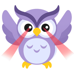
<OwlEmpty mood="not-found" title="No matches" />
<OwlEmpty mood="done" title="You're up to date" />State and icons
<StateBadge>Off</StateBadge><ContainerIcon name="inbox" />Panel header
The row at the top of every panel: --row-h tall, a 12px inset, a hairline rule under it and quiet ghost buttons. It lines up across panels.
<div className="flex h-(--row-h) items-center gap-2 border-b px-3">…</div>11 · Anatomy
Three panels on one ground.
A sidebar for where you are, a left panel for the conversation, and a content panel for the work. They share a header height, an inset and a gap, so the eye reads one surface.
Sidebar · background